 |
| The Sound of Stromess Fused plastic, paint and stitch 23 x 23 cm |
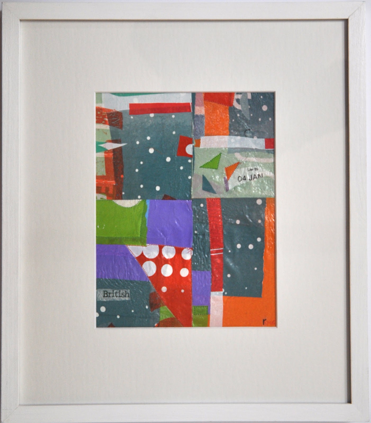
Wednesday, March 7, 2018
Sound of Stromness and Pigeons
Saturday, January 27, 2018
Is this good plastic?

In December I put all the plastic bags I collected from charity shops, museums, supermarkets and the cheese shop inside one of the bags and stashed it under my work table with the idea that I am going to do a snapshot of the months in plastic over the year. Not exactly dining on plastic, more seasonal plastic. I wonder whether the attitude about plastic will change it, whether marketing, colour, size will change as the year wears on?
I love that the Waitrose bag had a winter theme and I chose to put some complete writing on this piece in case I decide to use it for something I am submitting to. It says holiday, winter, joyful abundance to me.
I worked in a furious sort of way following ideas one after the other for a day and half. These are not in order of making.
Having just spent a long time working mostly in an observational way, I enjoyed playing with all the same elements but in an inutitve and differently restricted way. Most of these are first drafts. I may free float them, put them on a surface and use paint to make them relate to their edge differently.

 |
| front |
 |
| back |
'good plastic'?
And is there a male or female aesthetic in collage, in plastic?
Saturday, April 22, 2017
Growbags with an Orange View
 |
| Growbags with an Orange view, fused plastic collage with stitching 17 x 18cm |
Mumford's painting has a series of rectangles and squares - a sash window opened from the bottom, a table, a view and walls. Although I had plenty of blues in my dining on plastic bag, I thought I'd work differently today, fusing blues over different colours to get a different range of blues. I cut up whites, creams, blues, oranges and then a few greens. Instead of making a whole piece and cutting it up I fused five smaller pieces, abutting colour next to colour in ways that felt exciting; then I cut them up, moving them around until I was ready to assemble my collage, ironing each piece to another to make a squarish shape.
Last weekend we planted up some pots of tomatoes. I had been instructed to use tomato growbags as my compost. The mustard is the grow bag and an exciting new colour for me! The last piece I added to the collage was the lemon yellow near the middle.
Seeing the Howard Hodgkin exhibit inspired me. Those portraits! As I look at this I can almost see H H. Perhaps I should make a series. Alice, Howard, etc…?
Thursday, April 13, 2017
Highland Spring Greens
 |
| Highland Spring Greens, fused plastic stiching and paint, 21 x 21 |
The collage got dark very quickly and it was only by layering and ironing some pieces onto white that I was able to create any movement and depth. I wanted to evoke our hike, again, but through a kaleidescope of time.
I was disappointed not to be selected for a few things this week and in response I made a pile of mail art, using plastic. That was curative. I began this yesterday and went to sleep and then to London on what I needed to tie this piece together. To me it was obvious so I came out this evening to mix some carmine, magenta and burnt umber. After that it needed a little prussian blue and white paint. Now that it's all done, I can't help seeing something of Maine where the mountains meet the sea.
Thursday, April 6, 2017
Happy Hour with Peanuts, High Stile
The title for this piece comes from a Paul Klee quote, ' Color possesses me. I don't have to pursue it. It will possess me always, I know it. That is the meaning of this happy hour: Color and I are one. I am a painter."
I began with the latest pieces of plastic I had acquired: a Marks and Spencer's bag, a Jacobs cream crackers packet, a bag of mixed nuts, salad bags, and a Doriano biscuit wrapper. I added a bit of that kelly green from an old RA mailing (not members this year) because I needed that. I had been thinking about Klee, Mali Morris - she's coming to talk in Colchester on Friday, Howard Hodgkin and Rothko. In my mind these people gravitate towards bold shapes and colours. The Marks and Spencer's bag and my recent foray into grids for Nichola Orlick's exhibit in Kyoto was still in the back of my mind. I had finished putting a portfolio together for something coming up, so felt light, happy. It was happy hour.
With my stitching I like to accentuate colour relationships, to move them back, bring them forward and the colours in the frame seemed to make the most of the inner life of the happy hour. It was hard to keep it simple but I resisted the temptation to complicate things.
High Stile was where we stayed in the Lakes. Happy Hour in HIgh Style says Jazz to me.
Fishers, Werthers, Coffee & Watendalth

The second day we walked in the pouring rain to Watendalth. My memory of that was the loose stones and the bridge to the village. There was a lot of zig-zagging to avoid slipping, and we were all a bit stiff and weak in the knees from the day before.
The third day we went to the top of Robinson. Although it was raining and misty, the very red soil captured my imagination and reminded me of a walk long ago to the top of Mount Kenya. Patrick passed out the Werther's Originals on the way up, but on the way down we were holding on for dear life to fences, gorse, moss, branches -everything - down the steep path. It was a pity when we got to the car and discovered we didn't have the keys and had to walk another hour and another 1500 feet to the other car, rain still pummeling us.
This piece is full of layers, feels rain splattered and weathered, to me. As I tried to make these thoughts abstract enough to feel successful, I fear I lost some of the enthusiasm I felt as I walked.
Thursday, March 23, 2017
It's all about the packaging!
 |
| Lured by 'French Toast' Turquoise - fused plastic collage & stitching 15 x 15cm |
While Patrick was away I had been doing a big pastel drawing of a 2 meter long still life I had put together in the studio. The dominant colour is red so the red polka dot bag that the Ethiopian earrings came in spoke to me. I also found two balloons this week, fuscia and pink and that was perfect too as there is a fair bit of both those colours in the follow-on six-canvas-painting of the same still life set up. The final main colour in the still life is turqouise and as I gathered my plastic this week it was the plastic I bought because of the packaging that made this collage relate so perfectly to what I've been thinking about in my painting and drawing. The intention happened somewhere in the middle of selection.
I was sick while Patrick was away and pretty much ate leftovers every day and night but I did go to the grocery store on one occasion. I shopped purely by colour, though. I found myself walking down the biscuit aisle and chose something I have never bought, never imagined buying and had never tasted - 'french toast'. It is quite sweet and I wouldn't buy it again, but I did eat it all and so it was obvious I would use the plastic this week! The turqouise wrapper of the 'french toast' is a little shimmery too.
The collage and the painting have a similar sort of ratio of colour. Gillian Ayres was whispering to me.
Subscribe to:
Posts (Atom)